Visteria
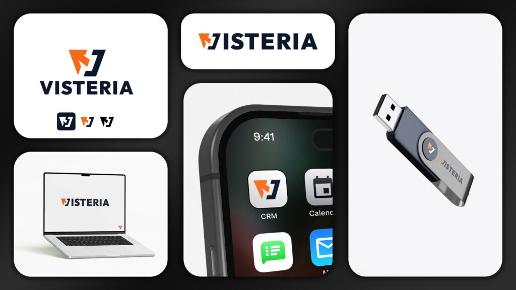
Visteria wasn’t a design project; it was a structural overhaul. We ignored aesthetics to focus on engineering. I stripped the brand down to its core, removing every “pretty” element that lacked a technical purpose.
The color contrast and typographic hierarchy weren’t chosen for “vibe”. They were engineered for impact.
Everything was calculated to force a position of market leadership. We traded artistic fluff for surgical precision, delivering a brand that doesn’t just exist; it dominates the space through raw, technical execution.
What’s inside the system
6 deliverablesMultiple Logo Variations
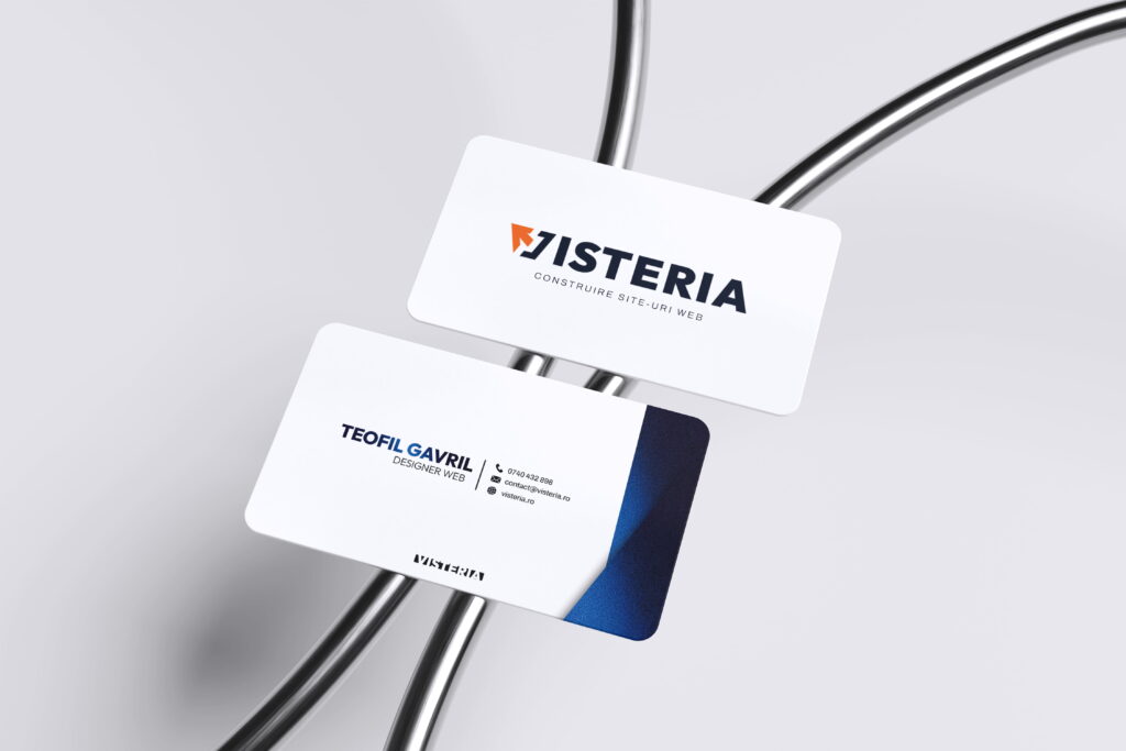
Business Card
Document Header & Footer
Email Signature
Mockups
Pattern & Background
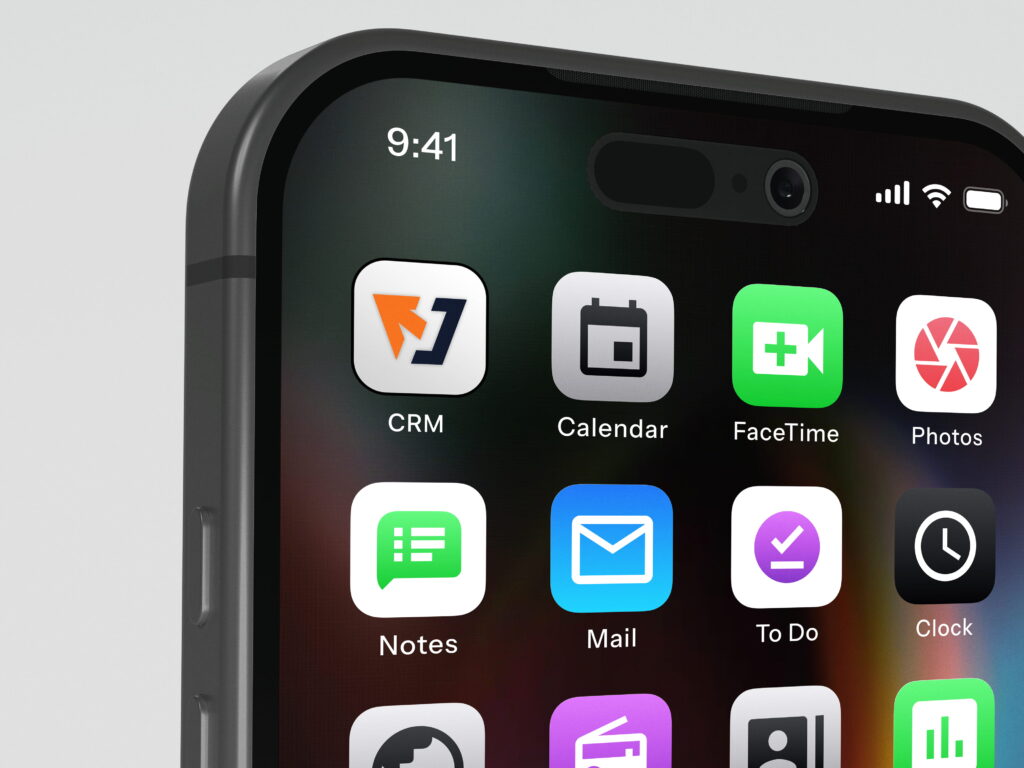
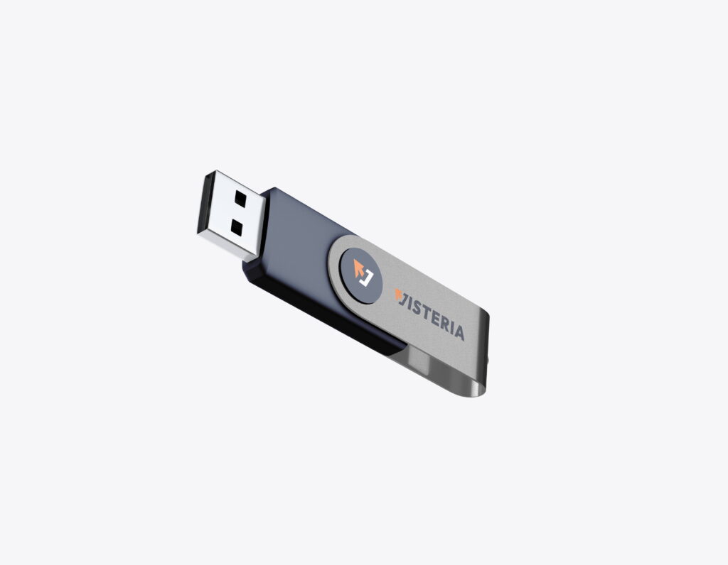
The system, in use.
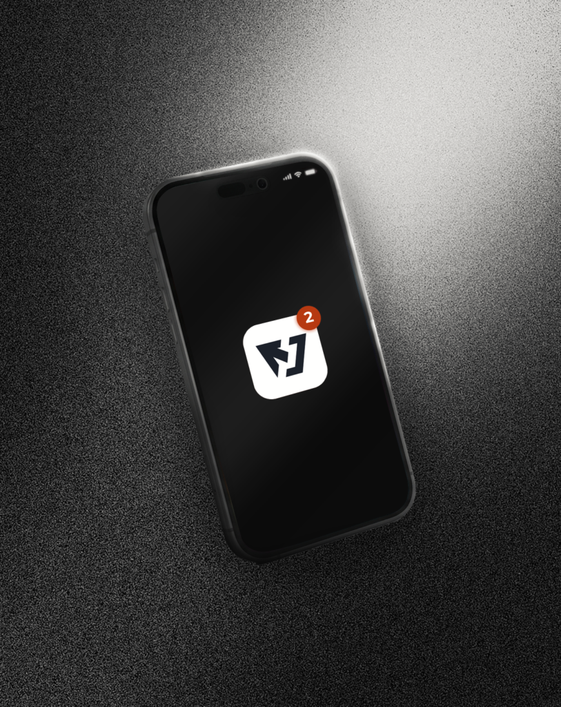
Selected mockups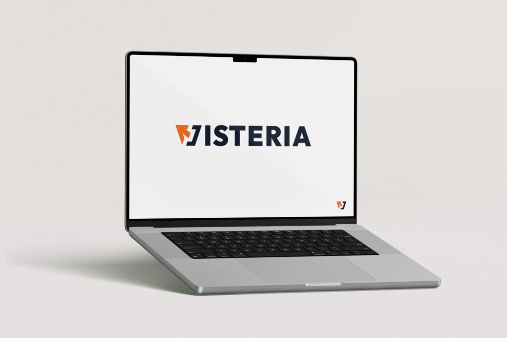
Most tech logos are hollow shapes drawn without structural logic. Visteria’s identity was no different: a generic, “safe” symbol that projected zero power and zero direction. It was a visual system failure, a forgettable mark lost in a sea of digital noise.
In an industry where you sell precision, a weak identity is a liability. There was a total disconnect between the brand’s technical expertise and its visual presence. I wasnt’t just fixing a logo; I was fixing a lack of authority that made the brand look like a follower instead of a leader.
The fix wasn’t a makeover; it was an architectural overhaul. I engineered a core symbol that merges the ‘V’ with a high-velocity cursor, a direct connection to the digital infrastructure Visteria builds. It’s a tech-heavy, agency-grade mark that functions as a precision instrument, not just an icon.
I paired this with a typeface that carries the weight of the entire brand. It’s bold, it’s unyielding, and it feels like it was forged specifically for this name. The typography delivers the core pillars: Support, Professionalism, and Experience in a single glance. There is no “decoration” here; every line weight and every curve was selected to match the logo’s structural integrity.
I delivered a visual anchor. The result is a high-contrast, high-impact system where the brand values aren’t just stated. They are hard-coded into the geometry of the design.