Introduction
Colors are more than just visuals — they are powerful psychological triggers. In fact, studies show that up to 90% of snap judgments about products are based on color alone. That’s why understanding color psychology in branding is essential if you want to connect with customers, build trust, and influence buying behavior.
In this guide, we’ll break down the science behind colors, how brands use them, and which color choices can help you win more clients in 2025.
1. Why Color Psychology Matters in Branding
When customers first see your brand, they subconsciously process your logo, website, and marketing materials within milliseconds. Color acts as a shortcut for meaning:
- Red signals energy, urgency, and passion.
- Blue conveys trust, reliability, and calm.
- Green suggests growth, health, and sustainability.
If your color choice doesn’t align with your brand values, you risk sending the wrong message.
📌 Example: Banks and tech companies often use blue (PayPal, Facebook, LinkedIn) to communicate trust and professionalism.
2. The Psychology of Each Color in Branding
🔴 Red – Urgency & Excitement
- Associated with passion, appetite, and urgency.
- Frequently used by fast-food chains (Coca-Cola, KFC, McDonald’s) to spark appetite and quick decisions.
🔵 Blue – Trust & Stability
- Symbolizes security, professionalism, and calmness.
- Popular in healthcare, finance, and tech brands (Dell, IBM, PayPal).
🟢 Green – Growth & Health
- Represents eco-friendliness, freshness, and balance.
- Used by brands like Whole Foods and Spotify to connect with health and sustainability.
🟡 Yellow – Optimism & Energy
- Suggests happiness, friendliness, and positivity.
- Brands like IKEA and McDonald’s use yellow to feel approachable and warm.
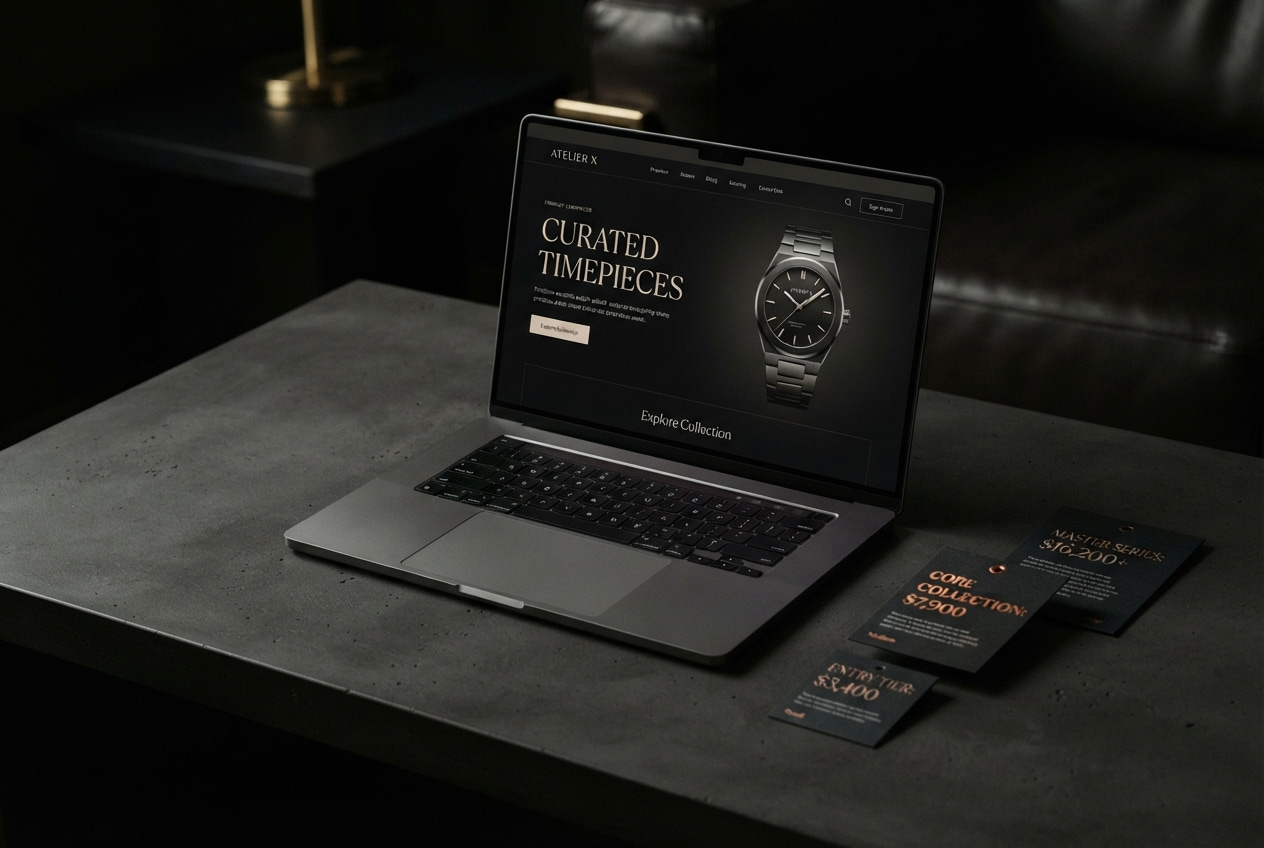
⚫ Black – Luxury & Authority
- Associated with exclusivity, power, and high-end elegance.
- Seen in luxury fashion brands like Chanel, Prada, and Nike.
⚪ White – Simplicity & Minimalism
- Conveys purity, modernity, and space.
- Common in tech and design (Apple, Tesla) to highlight sleek simplicity.
3. How to Choose the Right Brand Colors
When selecting brand colors, consider these factors:
- Target Audience Psychology – Different demographics respond differently (e.g., younger audiences prefer bold, vibrant colors).
- Industry Standards – Align with or differentiate from your competitors.
- Emotional Impact – What emotions do you want customers to feel?
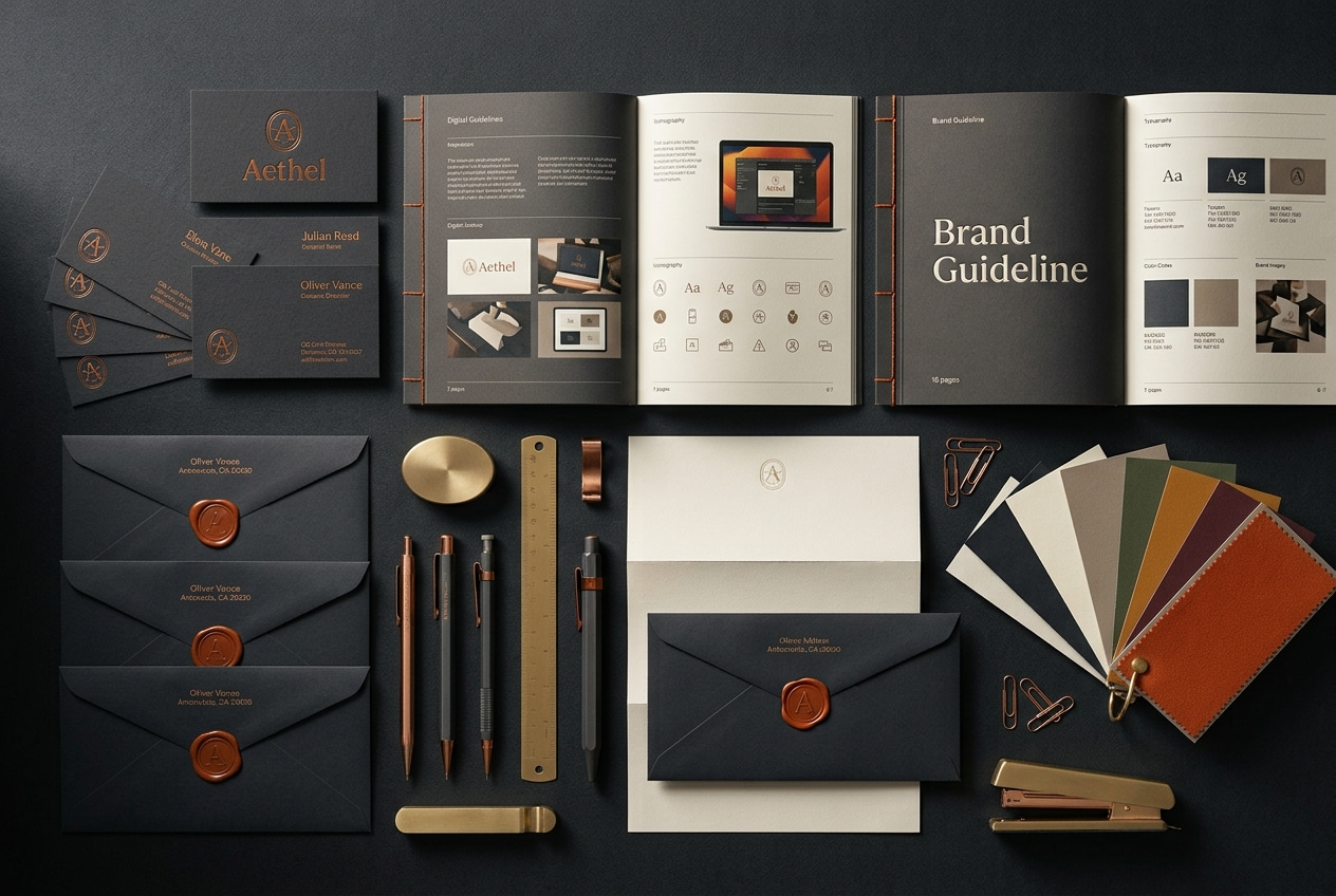
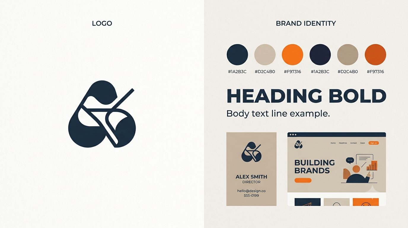
- Color Combinations – Use 1–3 main brand colors and complementary accents.
📌 Pro Tip: Use free tools like Coolors or Adobe Color to test palettes before finalizing.
4. Real-World Examples of Color Psychology in Action
- Coca-Cola (Red): Sparks energy and excitement, perfect for a fast-moving consumer brand.
- Starbucks (Green): Promotes relaxation and eco-friendliness.
- Apple (White + Silver): Minimalism that reflects innovation and simplicity.
- IKEA (Blue + Yellow): Trust + warmth = approachable home solutions.
5. Common Mistakes to Avoid
- ❌ Overusing too many colors → makes branding look unprofessional.
- ❌ Ignoring accessibility → low-contrast designs make it hard for users with visual impairments.
- ❌ Following trends blindly → choose timeless colors that support your long-term brand identity.
6. The Future of Color in Branding (2025 and Beyond)
In 2025, we’ll see AI-driven color personalization, where websites adapt color schemes to match user preferences. Also, brands are shifting toward eco-conscious palettes (greens, earthy tones) and digital-first gradients that stand out online.
Conclusion
Color is not just decoration — it’s strategy. By mastering color psychology in branding, you can influence customer perception, improve trust, and drive more sales.
Your brand colors speak before your words do. Choose wisely, and they’ll work for you 24/7.
✅ FAQ
Q1: What is color psychology in branding?
Color psychology in branding is the study of how colors influence customer emotions, decisions, and perceptions of a brand.
Q2: Which color increases sales the most?
Red and orange are known to increase urgency and conversions, especially in retail and e-commerce.
Q3: What color builds trust in branding?
Blue is the most trusted color, often used by banks, healthcare, and tech companies.
Q4: How many brand colors should I use?
Most experts recommend 1–3 core brand colors plus neutral shades for balance.
Q5: Are certain colors better for specific industries?
Yes. For example, green works well for eco-friendly brands, while black is ideal for luxury and fashion.
Work with Me – Let’s Build Something Amazing!
Want a website that’s not just another template, but a high-performance digital experience? I specialize in crafting stunning, fast, and user-focused websites tailored to your brand’s vision.
📩 Let’s make your website stand out! Get in touch today.
🔗 Contact Me | 🌎 Visit My Website